Added Tuesday, February 21st, 2012 @ 6:22 PM
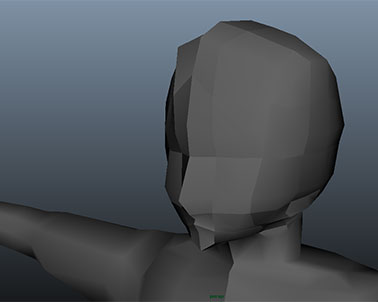
For this project, we were to recreate a character of our choice. I chose to recreate Link from The Legend of Zelda: Twilight Princess.
Added Tuesday, February 21st, 2012 @ 6:20 PM
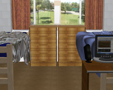
This was the first project for my intro to computer modeling class sophomore year. The task was simple—model and texture our bedrooms. At the time I was living in a dorm, so I modeled my dorm room. And when I say I modeled it, I mean I modeled it. Every little nook, cranny, and crevice made it into that model. Guess which side of the room was mine 😉
Here is my original description of the project:
This scene is a recreation of my dorm room in Jennings 211. I have included very minute detail in regards to the scructure and geometry of the room itself. Everything in this scene is completely to scale thanks to my trusty tape measure–centimeters were used in the scene, while inches were the “real” units used. There are over 500 objects, groups, primitives, etc. in this scene sporting over 110 materials/textures.
All of the bitmapped materials were taken as macro photos using both a hi-res SLR camera as well as a small but powerful digital camera. Although the lighting in the “real” room was quite inadequate for proper photography, I feel that the resulting bitmaps turned out pretty well.
The reason that I included certain objects over others is simply because they were either 1) bigger, 2) more important for the overall “feel” of the room, or 3) they are objects which I personally like, and thus, wanted to include. For example, the beds and desks were a must simply because they are the biggest entities in the room and take up of most of the space. The microwave and fridge I included because I felt they added much more to the room than would if I had left them out. The same goes for the posters on the wall; at first I didn’t think that I would include them, but after adding them, I realized that they too added much more to the room than if I had not included them. Most of the objects on the right side of the room are simply there because they are my personal belongings which I use most of all –my TV, my computer, and my Nintendo Wii. These fit into the third category of which I included due to my personal desire.
Nearly everything I constructed in this scene is made from one or more polygonal primitives, most of which are cubes. There are a few NURBS primitives as well, such as the posters (planes), the bed sheets (planes), the outside (behind the windows) (NURBS cube), and the poles in the closet (cylinders) as well as a few other things. As I said, most of the objects are made from polygons, many of which had been modified using the boolean commands Unify and Difference. Extrude, Sculpture Tool, UV Tools, Bevel, and Insert Edge Loop Tool were among the tools and manipulators that I used most of all.
There are only two images that I used from the internet. They are the covers of the two Wii games on the right-side desk. The games are Super Smash Brothers Brawl and Super Mario Galaxy.
http://www.vgboxart.com/boxes/Wii/4031-v3-orig.jpg-Super Smash Brothers Brawl boxart
http://www.vgboxart.com/boxes/Wii/9218_super_mario_galaxy_luigi_strikes_back-orig.png
-Super Mario Galaxy box art
These are the two objects I included in the scece that are not there in real life (the games have not been released yet). The reason I did not add more complex objects to the room is because I felt that the detail I inluded with the room and its objects were sufficient enough to fulfill that specific requirement (but I included them just in case) and because those are the two objects that I would most WANT to be in my room if I had the option, and in this case, I did!
Over 70 hours was spent on this scene, and I am pleased with the way it turned out.
Added Tuesday, February 21st, 2012 @ 6:16 PM
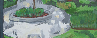
Here are the three paintings I did for my color painting class. The first is a painting of a small scene we set up in the studio. The second painting is an abstraction of the original painting. The final painting is recreation of the grassy area right outside the studio.
All three are oil paintings.
Added Tuesday, February 21st, 2012 @ 4:27 AM
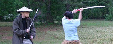
For this project, we were allowed to do whatever we wanted. Because I enjoyed making the stop motion movie so much, I decided to make a sequel to the original.
First it began… Now it continues… After blacking out, our hero wakes and will not rest until he finds the man who shot him and left him for dead. Along his journey, he runs across two fighters who, upon showing them a picture of the man, spring into action and fight our hero. They must know where this man is! Why are they protecting him?!
Added Tuesday, February 21st, 2012 @ 4:24 AM
The objective of this project was simple—make a narrative movie. I decided to make mine about a joke I had recently heard.
There are three versions of the movie because of the time constraints on the project. The longest version has the punchline, so if you’re only going to watch one version, watch the long one. However, the shortest and medium length ones simply end early, so I suppose you could watch the shortest, continue where that left off in the medium one, then continue where that left off in the longest. The choice is yours and yours alone!
Added Tuesday, February 21st, 2012 @ 4:22 AM
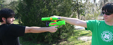
This assignment was to make a stop motion movie. I think there was a time limit of like four or five minutes, but I enjoyed making this project so much that I went a little over board :P.
The movie is about two strangers who run into each other in the park and just decide to have it out. Originally, the credits for the movie were meant to be just a short ending animation, but they ended up practically being a movie of their own!
Added 2/21/12 @ 4:20 AM
This was the first project in my time-based media class. The teacher started us off with something basic—make a short movie using some kind of visual effect(s). I decided to add some noise/film grain, add some sepia and yellow color, and use film scratch effects to simulate an old home movie about a father teaching his son to throw a football. Unfortunately, it got really dark and rainy the day we filmed, and because I was only home for the weekend (as were my friends who acted in it), we didn’t have a chance to reshoot it. That’s why there’s one shot near the end that’s super yellow—not enough light… :-/
Added 2/21/12 @ 4:16 AM
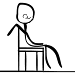
From what I remember, this was practically a mini project. I believe the syllabus said that we had to do a Flash animation at some point, and the teacher just wanted it to be a quick project so that we could move onto the next one. I think the only two requirements were to make an animation with Flash and to have it be one to two minutes long. It’s a simple little animation, but it’s fun.
Added 2/21/12 @ 4:11 AM
Here are most of the drawings I did for my perceptual drawing class.
Added 2/21/12 @ 4:02 AM
As the title suggests, we had to make propaganda posters for this project. I think we were supposed to make multiple posters, obviously I did. I can’t remember if the posters were supposed to be about something specific (like a product we liked or something), but I chose to make my posters about the current gen video game consoles at the time. Each poster lists a number of unique characteristics of the system, but does so in a flawed, “Internet message board”, “fanboy/fangirl” sort of way. In other words, they’re blindly spouting things about the system that have, or rather should have, no real bearing on someone’s decision to buy one system over the other, kind of like in political mud slinging, the negative things said about the candidates often times have no relevance on the issues at hand.
I drew the systems in Flash (because I liked that they were vectors, but I wasn’t too savvy with Illustrator yet), and I imported them into Illustrator to add the background color and text. Finally, I printed them out onto 3’x5′ sheets of paper.
Added 2/21/12 @ 4:00 AM
I believe we were supposed to create a scene within a cube for this project (I’m a bit foggy on the details…). I decided to make two related scenes, one on the outside and one on the inside. The outside scene is comprised of photographs with added speech bubbles and organized into a short scene. The inside is all hand drawn images. The relationship between the two scenes is that the outside is about how busy I was finding myself in college with all of my art projects. I was so busy that I rarely had time for anything else. The inside was about how I didn’t really consider the time spent on my projects as a bad thing; I had so many ideas floating around in my head that I was glad to have some way to make them realities.
The cube is made out of foam board that I cut into six squares. I then cut a recess into each of the sides and placed a thin layer of metal into the recesses. After completing the inside and outside images in Photoshop, I printed them out onto two large sheets of poster board which I cut into the shape of a flattened cube. I then spray mounted the foam board squares to the back of the outside images (the recesses with the metal plates were facing up) and spray mounted the inside images to the front of the foam board squares (this covered the metal plates). I then made a second, smaller cube out of foam board, and simply glued the sides of it together. Finally, I took magnet sheets and glued those to the outside of the smaller box. This way, the magnets would attract the metal plates and help keep the cube closed. The smaller box also held markers inside. These were supposed to be used by my classmates during the critique to draw on one of the inside panels. However, no one ended up drawing on it because no one wanted to “mess it up.” Oh well.


